Unpack It!
Unpack It
Brand identity for a program designed to create a safe space for open, unfiltered conversations about mental health and substance abuse.
Project Brief
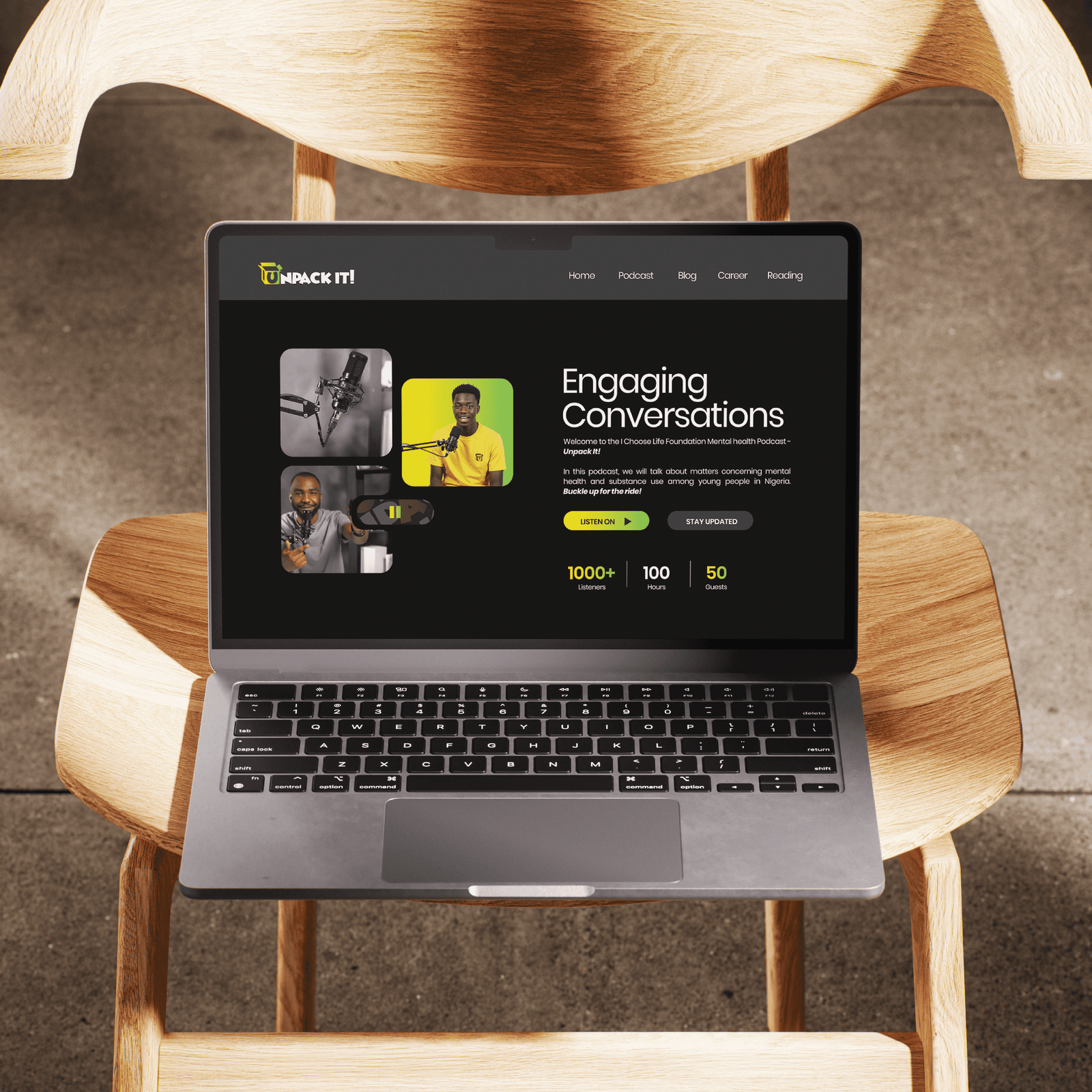
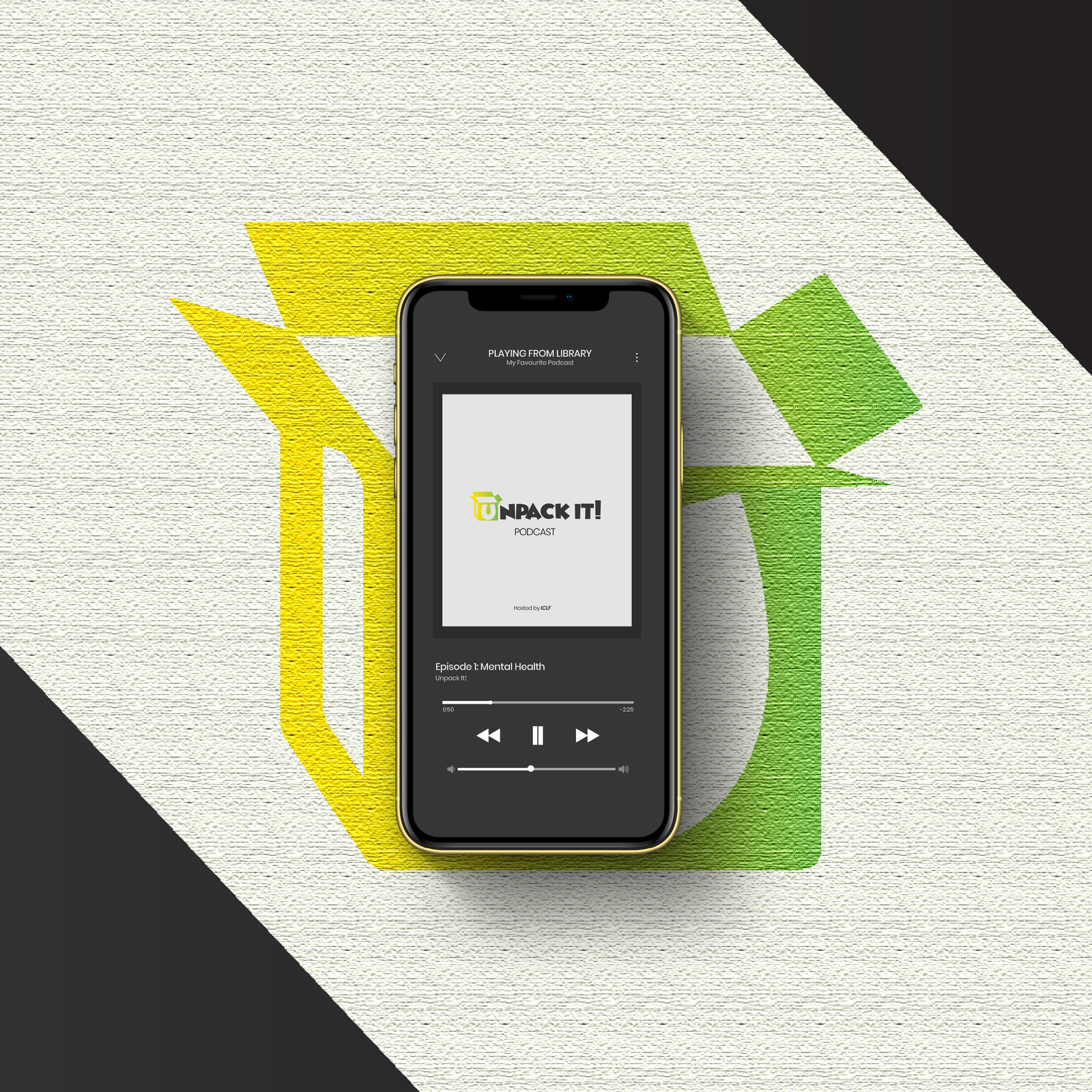
Unpack It! is a program by the I Choose Life Foundation, designed to create a safe space for open, unfiltered conversations about mental health and substance abuse. Through personal stories and expert insights, the platform aims to break the silence and stigma surrounding emotional and psychological struggles.
Our Approach
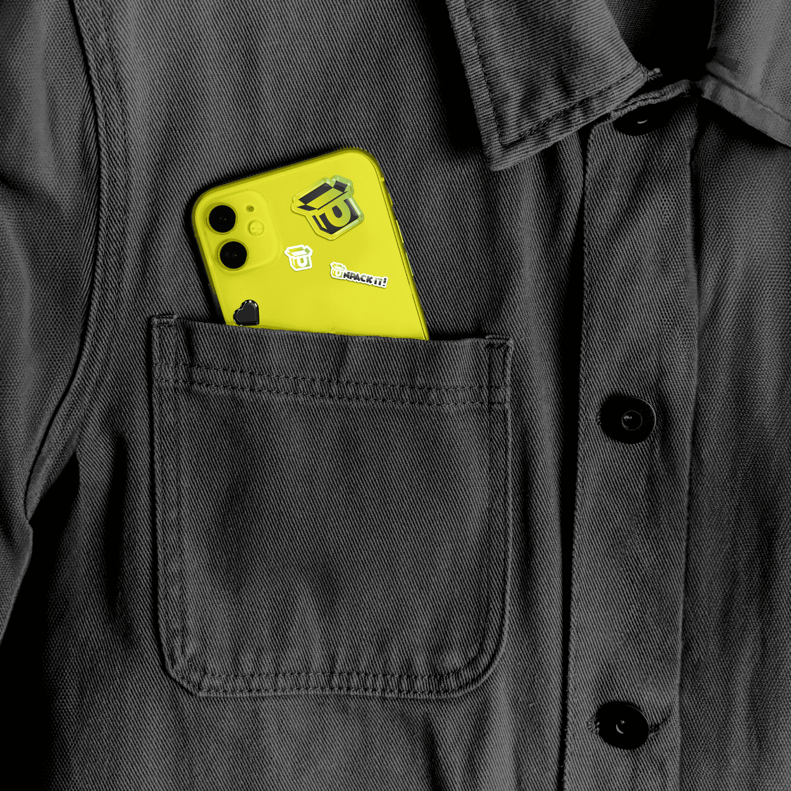
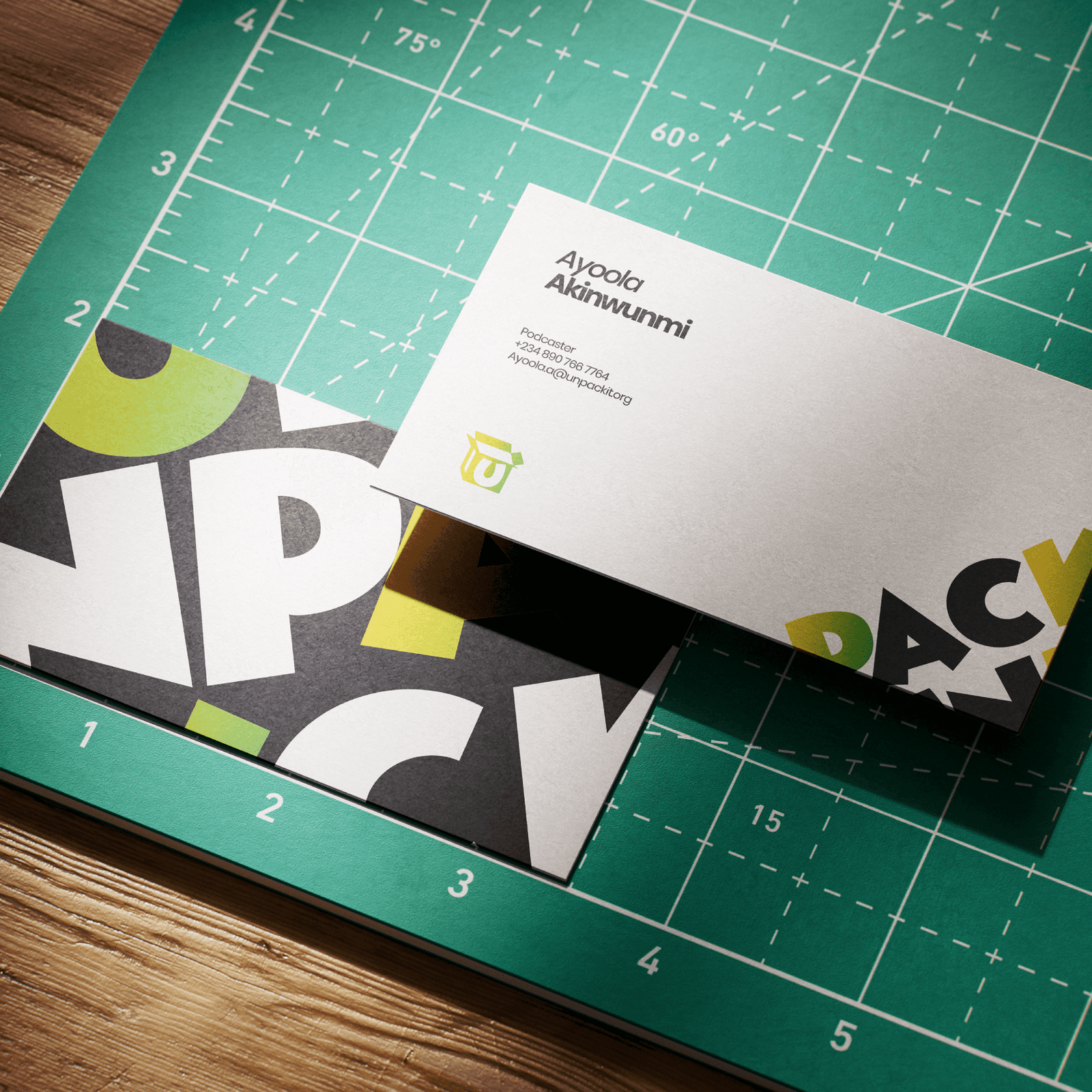
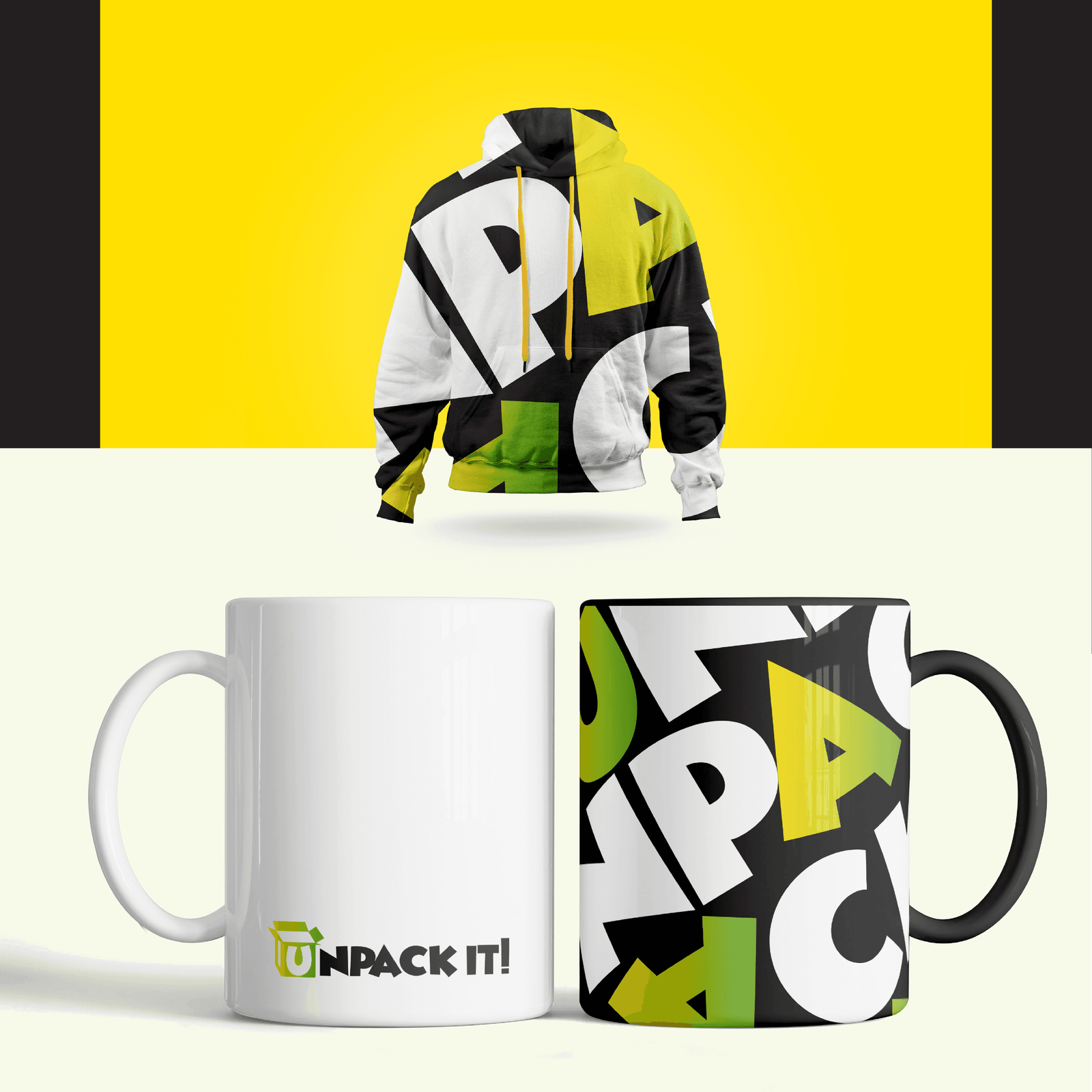
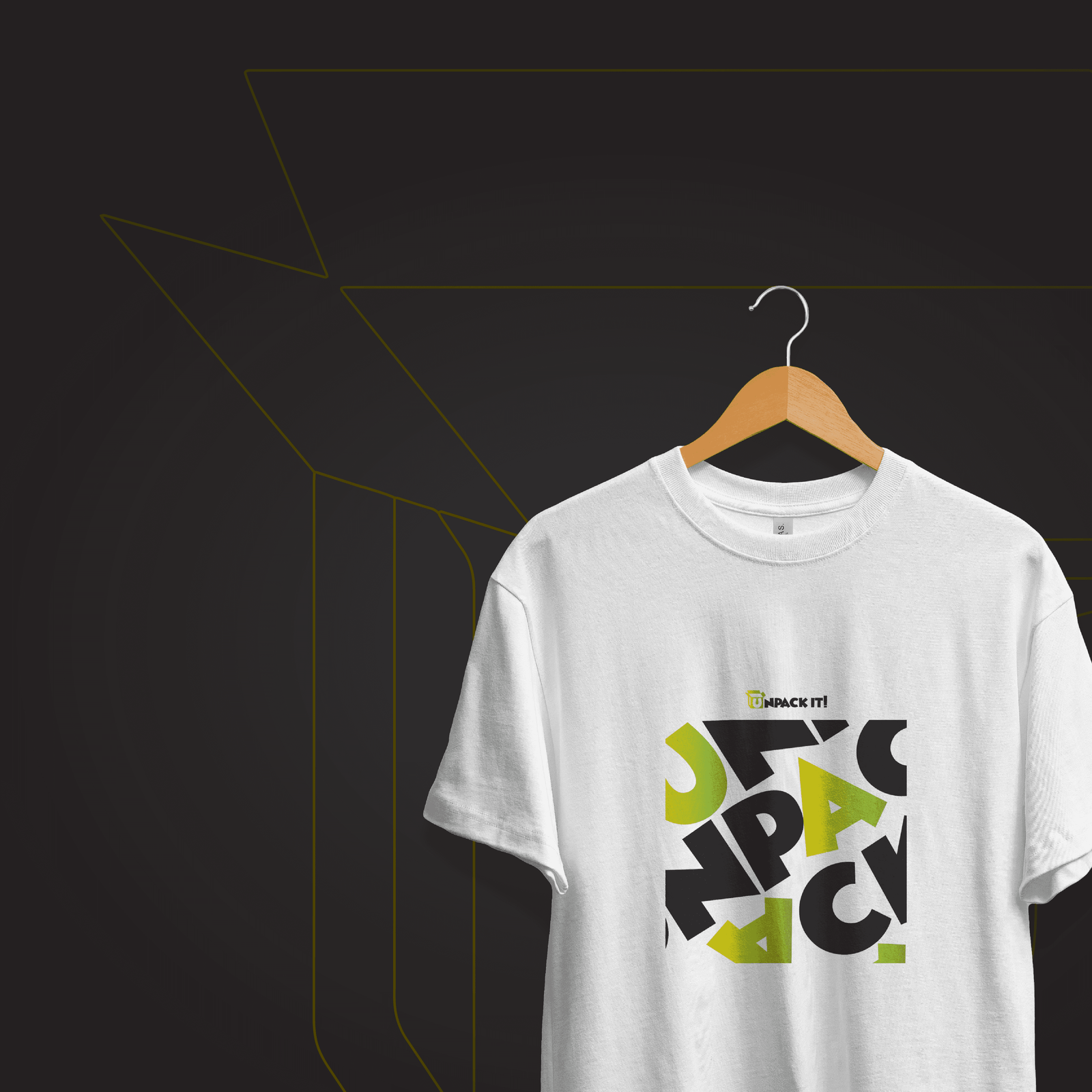
The goal of the logo design was to visually represent vulnerability, openness, and healing. The icon takes the form of an open box, symbolizing the act of unpacking buried emotions and facing truth with courage. Within the mark, the letter "U" is integrated into the box to emphasize you, the listener actively engaging in self-reflection. Behind it, the "I" forms a doorway, signifying an open passage to healing and understanding.
The Result
The result is a mark that feels warm, safe, and introspective, a visual metaphor for conversation, connection, and emotional freedom. It embodies what Unpack It! stands for: an invitation to open up, heal, and find light in shared human stories.
Scope of Work
Logo and Visual Identity
Project Gallery